Showing posts with label graphic design. Show all posts

Latice Works : Brochure Design for Realtors.

Why brochure design holds such an importance for marketing ?

 You can't explain the best features or benefits of your products or services in detail through billboards or print advertisement. Brochures are the most versatile tools you can use to give out information to customers of your products or services.On the whole, brochures can represent an organization in an extensive manner while advertisements or bill boards provide little opportunity for it. Brochures also have the opportunity to interact with their target audience for a longer time provided they are able to grab their attention. In order to grab the attention of the customers, the brochure should have an inviting & engaging design. In the following design our client wanted to show luxury and lifestyle.


Sound images and colors aren't the only features that's given in an brochure design, an appealing look, and the tag line ' make work a walk in the park' also help in grabbing the attention of the target audience.


 Brochure design is a highly productive marketing tool but it must be aligned with the nature of the business and target audience in order to reap its maximum benefits. 


 Marketers also take brochures to trade shows and presentations to hand out to potential customers or business associates. Brochures offer much more room for company and product information than other print items, such as a newspaper or magazine ad or direct mail letter or postcard.

 You can tell a story in a brochure over the course of the layout and end it with a call to action. 

Feel Free to contact Latice Design for Brochure Design and printing.
Contact No.: 7208876981
Email Id: Info@latice.design 


Latice Works : Logo Generation - OMAX EXIM .


OMAX EXIM LLP was founded last year on 11 February 2015 based in Delhi.
Omax Exim Llp’s industry's designated Partners are Toshit Garg,Rajat Singhal & Aditya Singhal.
This company business is about processing the nuts or dry fruits.That can be flavored nuts for instance. They import raw nuts and process in flavors.
The main operations in the cashew nut processing are Shell cooking ,Shell cutting,Cashew Kernel Drying ,Cashew Kernel Peeling,Grading & packing
There standard cashew nut process plant capacities: 30Kg to 500Kg.
Omax Exim's next step is to pack & supply in whole-sale.
Latice Design did OMAX EXIM's logo brand identity design.
Logo


Logo Proportion 
Branding 
Logo Color Options


Pantone Color 2016 - Serenity & Rose Quarts disciplines globally.


Rose Quartz and Serenity demonstrate an inherent balance between a warmer embracing rose tone and the cooler tranquil blue, reflecting connection and wellness as well as a soothing sense of order and peace.

ice cream cone stock photoEmpty ice-cream cone against a pink and blue background by lumina imagesfire escapes stock photofacade of the house with fire safety stairs by aragami12345sblue pink flowers stock photoBlue Hydrangea and purple rose by leungchopanplayful pastels and fun patterns:
playful pastels and fun patterns by Milk Designbowl of candy stock photoSouffle Sweets on the plate. Minimal Vanilla style by Evgeniya Porechenskayadeer snow stock photoDeer in the snow by Alin Brotea
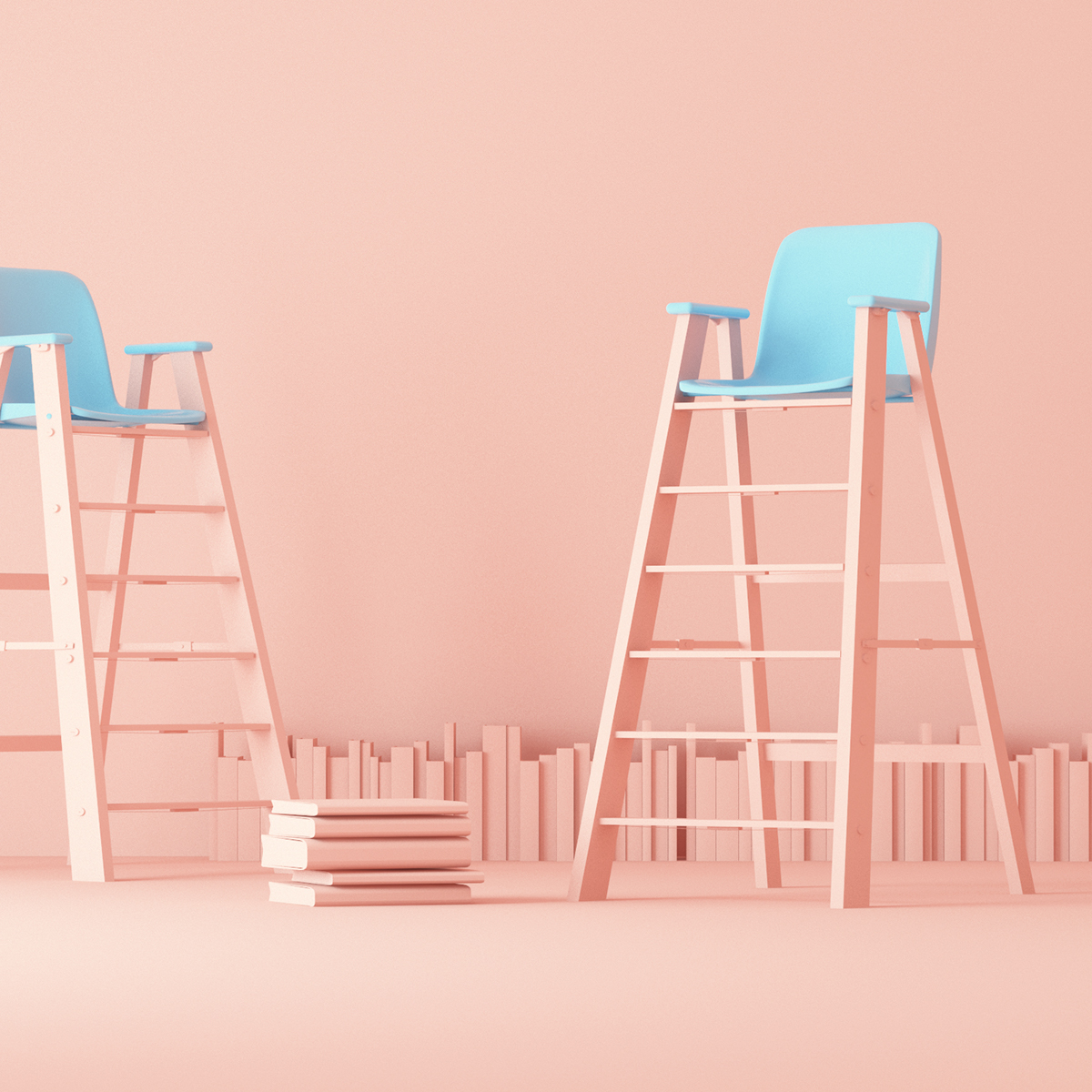
art direction | ladder + balloons | Be SpectACTive! Festival - ID on @BehanceLOVE THIS! i'm thinking these colors for the room. maybe a brighter turquoise blue?:
Traditional Crystal Chandelier from fashion-isha.com
Color Morphology by André Britz on Behance
Pastel colored Ombre nail art.
Set Design

 
Tessellated  Flooring with pantone 2016KitchenAid’s iconic Stand Mixer in Guava Glaze, a warm pink tone informed by PANTONE 13-1520 Rose Quartz.
KitchenAid’s iconic Stand Mixer in Guava GlazePantone UNIVERSE mugs in the 2016 colors of the year, PANTONE 13-1520 Rose Quartz and Serenity 15-3919
Pantone UNIVERSE mugs in the 2016 colors of the year

We found various photographs on pinterest inspiring the panton pallet 2016. 
The prevalent combination of Rose Quartz and Serenity also challenges traditional perceptions of color association

.“We look at the history of where we’ve been with color and ask ourselves, is this a time for change? Our feeling was: yes.”

What’s come through loud and clear is that Pantone’s Color of the Year is arguably most interesting as a conversation-starter, never as a dictum to be blindly obeyed. Their selection process pinpoints colors that seem ascendant across design disciplines globally — fashion, interiors, housewares, packaging and product, graphic design and more — but not yet completely dominant. They choose a color reaching a tipping point and give it a public nudge, so we all finally notice it and talk it over.