Coding : more than a job skill, it is a new literacy for the 21st century

3:05 AM Latice Design 0 Comments


In the 1960s, Seymour Papert advocated that all children should learn computer programming. Today, finally, millions of students are learning it, but there is a lot of work to be done to truly democratize this new literacy. Project Bloks is a platform to enable designers to create new and creative tangible coding languages and kits for children. Ultimately we want to offer a powerful and open hardware and software platform that makes it easy to invent novel ways for children to learn how to code, using new form factors, metaphors, and knowledge domains.


Google today announced Project Bloks, a new open hardware platform that allows developers, designers and educators to build physical programming experiences that can help kids (5+) learn to code.

Physical coding
Kids are inherently playful and social. They naturally play and learn by using their hands, building stuff and doing things together. Making code physical - known as tangible programming - offers a unique way to combine the way children innately play and learn with computational thinking.

However, designing kits for tangible programming is challenging—requiring the resources and time to develop both the software and the hardware. Our goal is to remove those barriers. By creating an open platform, Project Bloks will allow designers, developers and researchers to focus on innovating, experimenting and creating new ways to help kids develop computational thinking. Our vision is that, one day, the Project Bloks platform becomes for tangible programming what Blockly is for on-screen programming.

The Project Bloks system
We’ve designed a system that developers can customise, reconfigure and rearrange to create all kinds of different tangible programming experiences.

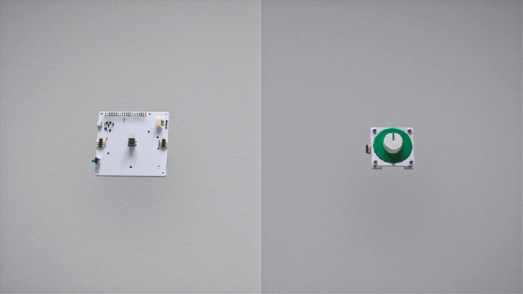
The Project Bloks system is made up of three core components the “Brain Board”, “Base Boards” and “Pucks”. When connected together they create a set of instructions which can be sent to connected devices, things like toys or tablets, over wifi or Bluetooth. 

The three core components of the Project Bloks system

Pucks: abundant, inexpensive, customisable physical instructions
Pucks are what make the Project Bloks system so versatile. They help bring the infinite flexibility of software programming commands to tangible programming experiences. Pucks can be programmed with different instructions, such as ‘turn on or off’, ‘move left’ or ‘jump’. They can also take the shape of many different interactive forms—like switches, dials or buttons. With no active electronic components, they’re also incredibly cheap and easy to make. At a minimum, all you'd need to make a puck is a piece of paper and some conductive ink. 

Pucks allow for the creation and customisation of endless amount of different domain-specific physical instructions cheaply and easily.

Base Boards: a modular design for diverse tangible programming experiences
Base Boards read a Puck’s instruction through a capacitive sensor. They act as a conduit for a Puck’s command to the Brain Board. Base Boards are modular and can be connected in sequence and in different orientations to create different programming flows and experiences.

The modularity of the Base Boards means they can be arranged in different configurations and flows

Each Base Board is fitted with a haptic motor and LEDs that can be used to give end-users real time feedback on their programming experience. The Base Boards can also trigger audio feedback from the Brain Board’s built-in speaker.

Brain Board: control any device that has an API over WiFi or Bluetooth
The Brain Board is the processing unit of the system, built on a Raspberry Pi Zero. It also provides the other boards with power, and contains an API to receive and send data to the Base Boards. It sends the Base Boards’ instructions to any device with WiFi or Bluetooth connectivity and an API.

As a whole, the Project Bloks system can take on different form factors and be made out of different materials. This means developers have the flexibility to create diverse experiences that can help kids develop computational thinking: from composing music using functions to playing around with sensors or anything else they care to invent.

The Project Bloks system can be used to create all sorts of different physical programming experiences for kids

The Coding Kit
To show how designers, developers, and researchers might make use of system, the Project Bloks team worked with IDEO to create a reference device, called the Coding Kit. It lets kids learn basic concepts of programming by allowing them to put code bricks together to create a set of instructions that can be sent to control connected toys and devices—anything from a tablet, to adrawing robot or educational tools for exploring science like LEGO® Education WeDo 2.0.

"Project Bloks - Creating A Development Platform For Tangible Programming". Project Bloks. N.p., 2016. Web. 28 June 2016.

0 comments:

Why GOOD DESIGN is necessary for your brand to sell .

11:35 PM Latice Design 0 Comments


If brands, department stores or car showrooms are so alluring due to their point of sale and marketing , why shouldn’t this be considered a crucial component to the success of your business?

There is no doubt in our minds at Latice Design that a well designed world is a better world to live in. This applies to many different aspects of our daily lives. Consider your experience when you walk through a retail shopping center to be engaged by window graphics and promotions. When flipping through a brochure with beautiful imagery and layouts, or shopping at an upscale boutique where big named brands are all around you. These interactions are all made more enjoyable by the appeal of the design. A good looking product, with nice packaging or point of sale is more desirable to the user than one that appears underdone or overlooked.
That’s why good design sells. If  brands, department stores or car showrooms are so alluring, why shouldn’t this be considered a crucial component to the success of your business?
Design consideration should be at the core of any business marketing. A lack of consideration for the design of your company’s website or sales literature promoting the products you market is selling yourself short. Your business’s marketing materials is a contributing factor to the decisions consumers make about your products or services, and whether or not they are interested in what you offer. This is why visual appeal is your driving force.
When a consumer is presented with numerous options about a particular good or service, you want to be the chosen one. But if you’re offering the same product as 10 other companies, what’s going to make you stand out? Latice Design understand that desirability plays and important and often a decisive role in product or service selection. Good design can make your product or service seem more trustworthy and professional, which are major selling points in any marketplace. It’s a well known fact that consumers make decisions based on reliability and trust, so you need to make them feel like they are in intelligent and responsible hands. This is where our designers at Latice Design can work hand-in-hand to assess what your customers are responding to and, if necessary, re brand or redesign your marketing strategy.
Whether you are in the process of establishing a start up business or thinking of revamping your company’s look, there are a few important points that we want you to consider:

What is the message you want to convey?

Any design decisions should be made with an end-goal in mind. You want your customers to feel a certain way about your business and this should be reflected in the image you project to them. Without considering your message, you may be confusing your consumers with conflicting ideas or lack of direction.

Who are you marketing your product to?

This point is somewhat an extension of the last, but it’s a crucial consideration. Aside from the general message you want to convey, you need to consider who will be receiving it. These considerations should be shown in the decisions you make about the look and feel of your product or business.
If you are redesigning, will the changes be minor or a complete revamp?
When updating an existing company’s identity, it’s important not to lose all recognition from your brand’s loyal consumers. Some companies choose to make subtle changes to their look periodically in order to stay fresh and modern, while others may make more drastic changes. In either case, your new design should still speak to the previous look to retain brand awareness.
Redesigning your marketing materials involves a number of very important decision making processes. Our team have a number of key things you should consider when doing a marketing revamp.
Remember good design sells and our page on  things to consider when doing a marketing revamp is a great place to start when brainstorming about what direction your company should be moving in. Consideration of your target audience, what message you seek to convey, and a close attention to design details should likely lead to a great redesign and an appealing company look.
If you  would like more advise on generating design that sells  why not call Latice Design now on      +917208876981 or Email us : info@latice.design

0 comments:

The Pantone Cafe: Color Food For Thought !

10:43 PM Latice Design 0 Comments


For its second season, the Pantone Cafe - the most Instagrammable restaurant in the world - returns to Monaco. Intersecting the food and design spaces, it's the world's only restaurant featuring a Pantone color-coded menu.


  The Pantone Café gives a new meaning to a multi-sensory culinary experience. With a focus on healthy products, customization, and engagement, this year's café is colored in PANTONE 18-1764 ("Monte Carlo Red") and boasts a brand new menu featuring sandwiches, salads, pastries, cocktails, coffee, and an array of fresh, cold pressed juices. Items are named after the color of an entire item, a specific ingredient, or reference a brand's signature hue, such as "Heineken Green."


 an eclair is paired with a rich, chocolate brown packaging; water bottles bear a soft blue label; and an aperol spritz is served in a vibrant orange vessel. in addition to the menu items, saturated tones are applied to folding chairs, food trays, napkins, and the façade of the pop-up restaurant, forming a visual and vibrant experience for visitors to the coastline microstate’s bustling .


 an eclair is paired with a rich, chocolate brown packaging; water bottles bear a soft blue label; and an aperol spritz is served in a vibrant orange vessel


pop-up pantone cafe serves up color-coded snacks in monaco
all images courtesy of pantone cafe


On the shores of the french riviera, monaco restaurant group has opened ‘pantone cafe‘, a vibrant bistro influenced by the color identification system created by lawrence herbert in 1963. 

0 comments:

Budapest-based designer Judit Besze developed a fresh vintage inspired branding !

12:27 AM Latice Design 0 Comments


The sun has finally come back to Vienna and there is a distant smell of spring around the city. It will still take some time until everything is blooming again and until then there is nothing better than buying yourself a nice bunch of tulips or peonies for the weekend. A flower shop where I would definitely like stop by is FLEUR

A classic and clean logo kept in white and kraft paper brown is contrasted by beautiful pastel vintage floral arrangements. These two seemingly very different element fit together perfectly and create a fresh yet elegant feeling. The branding work includes everything from business cards, wrapping paper and bags to the website. We are delighted and hope that more and more flower shops will discover the allure of good design.


FLEUR  
FLEUR Visiting Card
FLUER Envelops 
FLEUR Stationary Variables  
FLUER Letter Head 
FLEUR Stationary Variables  

FLEUR Stationary Variables  
FLEUR Paper Bags

FLEUR Paper Bags
FLEUR Paper Bags
FLEUR Poster
FLEUR Wrapping Paper

FLEUR Paper envelopes

FLUER Desktop 


FLUER Desktop 

FLEUR Mobile Web and Tab

FLUER Branding 

FLUER Store


0 comments:

UEFA European Championship branding 1968 - 2016 .

4:06 AM Latice Design 0 Comments


Soccer fans are getting excited as the UEFA European Championship kicks off in France this week (and on television screens around the world). This is the 15th time that European soccer elite will meet to battle it out for the European crown. And, like with all major sporting events these days, the tournament will be abuzz with an array of advertising, branding and events. Marketing activities grow larger and larger every year, as brands latch onto the event as a way to market their products.

But what about the UEFA European Championship brand itself? Every four years the Euros logo also gets made over for the tournament, often times taking on symbolic elements of the host country. Throughout the years, the logo designs have gotten more and more sophisticated. Yes, even in soccer design and aesthetics are important!

Here’s a look at the evolution of the UEFA Euro Cup logos over the years:

1968 – 1992

The first seven times the European Championships were held—between 1968 to 1992—the logos were very similar and form a cohesive group.


Each of these logos is comprised of the flag of the respective venue and the year of play. The organizing committee—the Union of European Football Associations (UEFA)—acronym is printed in a bold, geometric font and attached to two copies for the host country’s flag to create one dynampic, flapping flag. The year is outlined, giving these Euro Cup logos a real old-school, retro feel. These designs may not win a design award, but they’re an authentic representation of the emblematic sports design style from the 70s to the early 90s (and which has made a recent resurgence in popular “vintage” clothing styles). This set of logos play our our emotions, create a sense of nostalgia and fondness for the event.

1996 in England


In 1996, the Euros returned to the motherland: England. This happy, color logo is markedly different from it’s predecessors (and was perhaps inspired by the Queen’s favorite colors?) The design is playful, almost childish. The soccer ball is subdivided in such a way as to represent a player kicking a ball. The line of the player moves from lower left to upper right, symbolizing the dynamic, athletic movement of the sport, and indicating an upward climb (like a tournament is a climb to victory). Below the icon the wordmark is comprised of three different typefaces, perhaps symbolizing a coming-together of multiple countries and cultures. The brush-like underscore again generates movement. As it was individually adapted to the event, this logo feels fresh and unique in comparison to the ones from previous years.

So who felt that upward swing of movement in 96? Germany did, taking home the cup.

2000 in Belgium and the Netherlands


Again, the national colors of the host countries are used to create the color scheme. The typography, however, is much more delicate and less playful. It’s also been reduced to only two fonts, creating a much cleaner look. A generic human-like shape is made up of the combined flag stripes of Belgium and the Netherlands. He has a floaty, kite-like appearance, making him look like a medium gust of wind could pick him up and fling him across the field. Again, the design moves from left to right, down to up, showing movement, but because it’s so top-heavy it makes it look like the player is unbalanced and about to fall over. A small football sits in the center to balance the design and a bluish gray circle ties all of the elements together. This is probably the worst UEFA Euro Cup logo to ever play the game.

Which team was able to remain balanced in 2000? France took home the cup that year.

2004 in Portugal


It’s going to be sunny! 2004 takes us to beautiful Portugal, which is known for sun, sea and a great passion for football, all of which translates clearly to the logo! While blue dominated the previous years’ logo, it is missing completely in 2004. Instead, the logo is comprised of a bright orange, yellow and green giving the logo a touch of warmth and hospitality. Similarly, there’s nothing resembling a player anywhere in this logo. While this version of the logo is a nice change of pace, the soccer ball emblazoned in the center of a cliché, curved heart is not very subtle in its symbolism. The significance of the seven green dots along the right side is less clear. A relationship with nature? Soccer? The designer just liked polka dots?

Greece found a place in the hearts of spectators this year as the surprise winner.

2008 in Austria and Switzerland

Austria and Switzerland are known for their mountains—and these high peaks are the prominent feature in the 2008 Euro Cup logo! Both countries’ flags are also comprised of red and white, making them the natural colors to select. The shape of the peaks and the red color could also have another meaning: the game is on fire! Nestled inside the red swoop, a green ball—its colors reminiscent of the unspoiled nature we associate with alpine countries—offers contrast to the red. For the first time, the sport is associating itself with nature. The font this year is a simple sans-serif in several weights, perhaps a nod to Swiss minimalism?

 Apparently the Swiss and Austrians aren’t the only ones good at climbing mountains: Spain took home the championship in 2008.

2012 in Poland and Ukraine


Four years later, the 2012 UEFA Euro logo was significantly more feminine than ever before, and even more tied to nature. It’s comprised of a stylized flower with abstract football as its main blossom and the national colors of Poland and Ukraine as accents. Inside the flowers and the ball, a human-like figure appears to throw his hands up in victory. This logo brings sport and nature together. Not only is it a literal flower, but the shapes are more rounded and organic than its predecessors’. But does this association between hard-hitting professional sports and the beauty of nature really work? Not really. This logo is more reminiscent of Eastern European folklore than it is of athletic prowess.

Spain (once again) plucked the flower and went home with the win.

2016 in France


Soccer meets art! For the first time in history, the trophy is part of the Euros’ logo. Previously, this was a differentiator between the look of the Euro Cup logos and the World Cup logos. No surprise, the color combination of blue, red and white represents France, the host country. This new logo is much more modern and subtle than its predecessors. There is no ball, no player, no obvious or traditional country symbols. Rather, meaning is created through form and abstraction. Circles, stars and arches are reminiscent of a smiling face. But even after prolonged viewing is not clear how the individual picture elements are thematically related to each other. The logo opens a wide scope for interpretation.

Who do you think will win the UEFA Euro 2016? Let us know in the comments!

0 comments: