Two Pantone Convertibles GTs - Color Of The Year

11:51 PM Latice Design 0 Comments


Bentley-panatone-chickdriven-7

Bentley never ceases to amaze, especially after the company joined forces with Pantone—the world leader in color exploration. The highly anticipated collaboration honors Bentley’s brand-new flagship store opening in Frankfurt, Germany. The British car company unveiled two all-new Continental V8 GTs, which don the vibrant hues of Pantone’s 2016 colors of the year: Rose Quartz and Serenity.

Screen-Shot-2016-07-27-at-10.08.56-AM-818x545

bentley panatone

Each year, many people anticipate the release of Pantone’s chosen hue. This year, however, the company decided to switch it up and chose two colors to represent 2016 instead of just one. According to their website, Pantone explains, “Joined together, Rose Quartz and Serenity demonstrate an inherent balance between a warmer embracing rose tone and the tranquil blue, reflecting connection and wellness as well as a soothing sense of order and peace.”

bentley panatone

Pantone says that the main reason they released two colors was due to the blur in gender throughout mainstream fashion companies. Rose Quartz and Serenity mixed together are the perfect combination.

Bentley-panatone-chickdriven-6
bents

But the vibrant hues of the colors are not the only reason why people are fawning over the Continental V8 GTs. Bentley also redesigned the signature convertible, which now has new features including an all-new front and rear design, retractable hard top roofs and more roomy interiors for more comfortable rides. If you see one on the road, it’s okay to turn your head in envy. We sure would!

Bentley-panatone-chickdriven-9
 Bentley-panatone-chickdriven-8

"Bentley + Pantone Create Continental GT's With Colors Of The Year". designboom . N.p., 2016. Web. 1 Aug. 2016.

0 comments:

Product Packaging Hair Care : Überliss

12:10 AM Latice Design 0 Comments


Hot patterns alert! Packaging of professional hair care products are usually quite plain, leveraging cues of science and technical when it comes to colours, finishes, and materials. 


Design firm FormNation changed the status quo with the rebrand of hair care brand Uberliss. Talking of the design, the team says: “Uberliss requested a rebrand to feature a new look that is both sophisticated and upscale, suited for the most prestigious salons.”


PHOTO © 2015 LISA KLAPPE

PHOTO © 2015 LISA KLAPPE

PHOTO © 2015 LISA KLAPPE

The product market is saturated and brands need to differentiate themselves in more creative ways. The packaging of Uberliss incorporates hand-drawn artworks and fashion-forward design to create something non-traditional and avant-garde. The design included hand-drawn patterns for each ingredient based on what each product does with our hair – straightens, curls, dyes, washes, conditions. 

PHOTO © 2015 LISA KLAPPE

Screen Shot 2016-07-20 at 11.09.26 AM.png

Screen Shot 2016-07-20 at 11.09.36 AM.png


FormNation divided the design into two lines: black bottles for the salons (UV proof) and white bottles for the consumer. The top layer features information blocks and the layer underneath is dedicated to graphics that can change with the trends based upon the playfulness of the brand. 


A beautiful work of art.


PHOTO © 2015 LISA KLAPPE


PHOTO © 2015 LISA KLAPPE

"Überliss ‹ Formnation". Formnation.com. N.p., 2016. Web. 27 July 2016.

0 comments:

Cairo Crayons Packaging by Niv Ginat

10:55 PM Latice Design 0 Comments


Cairo Crayons is crayon packaging of the ultimate convenience. Color without having to dump all your crayons out, only to painstakingly stuff them in after. Easily unroll the container to find all the colors exactly where you need them. When done, simply roll the the container back up and slide the top on.


"Cairo Crayons | Niv Ginat". Nivginat.com. N.p., 2016. Web. 25 July 2016.

0 comments:

SOFISTICADA : Designed by Robinsson Cravents.

3:10 AM Latice Design 0 Comments

Beautiful minimal packaging and branding for a new cosmetics beauty brand called SOFISTICADE using tones of rose and skin color combined with a golden tone in simple and clean design language. SOFISTICADA - A skin care brand "Locking the skin time". Designed by Robinsson Cravents.


0 comments:

Package Design : Higher Living Oraganic Chai by B&B Studio

11:19 PM Latice Design 0 Comments


Higher Living is a British company who have been blending teas, herbs and spices for over 45 years using only 100% natural and organic ingredients. 

Branding and packaging for organic tea company Higher Living by B&B Studio, United Kingdom

Continuing their collaboration with Higher Living, which began back in 2010, London-based graphic design studio B&B Studio worked with the company, following a recent expansion of the range, to help redefine its packaging and brand identity with the intention of establishing a new system that would help consumers navigate an increased variety whilst also retaining its idiosyncratic qualities.

Branding and packaging for organic tea company Higher Living by B&B Studio, United Kingdom

More products often require a more defined hierarchy with increased communicative clarity, alongside a distinctive and unifying visual expression. So, while clearly unique in the market, the detail of the previous design felt busy and detracted from the smaller differences in form that looked to divide blends. In retrospect, although lovely, these smaller details did not appear pronounced enough, or provide enough room for greater variation as the range increased.

Branding and packaging for organic tea company Higher Living by B&B Studio, United Kingdom

This is resolved through the addition of more space that draws the eye in, heavier and simpler forms, finer detail contained within these forms, and fewer tints and shades. It gives far more space to, and detracts less from typographical communication and benefits from a stronger and larger logo lock-up

Logo for organic tea company Higher Living by B&B Studio, United Kingdom

The previous design was far less logo-centric, illustration was impact-ful enough to define brand, although at the expense of quickly and clearly defining individual products. The original logotype felt too fine and without character to be memorable on its own outside of packaging. This new design favors a more logo-centric hierarchy, but roughly equaled by a unique and communicative illustrative expression, an element of storytelling and engagement through company and consumer-contributed haiku's (not shown) as well as a scene to color in the inside wall. This gives packaging and brand a bit more depth of expression.

Branding and packaging for organic tea company Higher Living by B&B Studio, United Kingdom

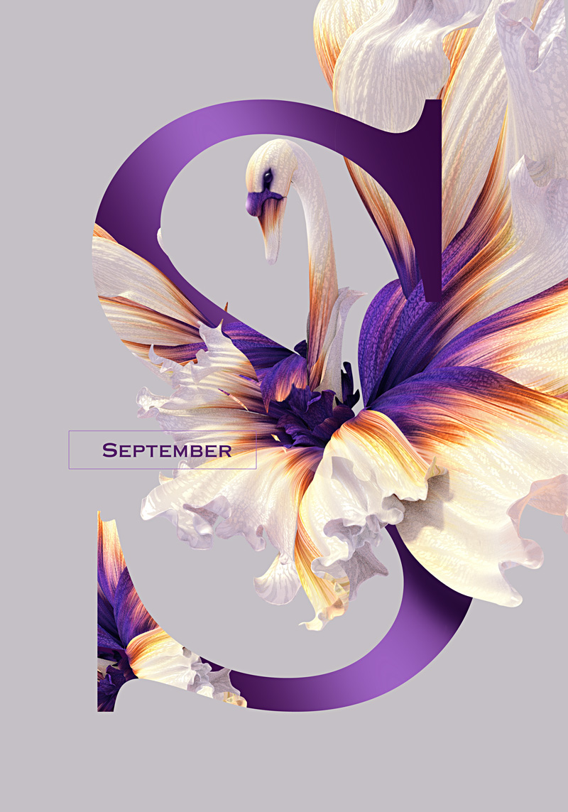
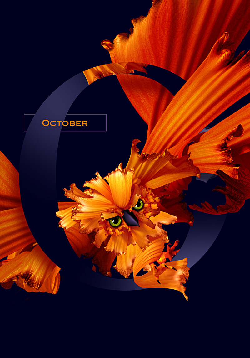
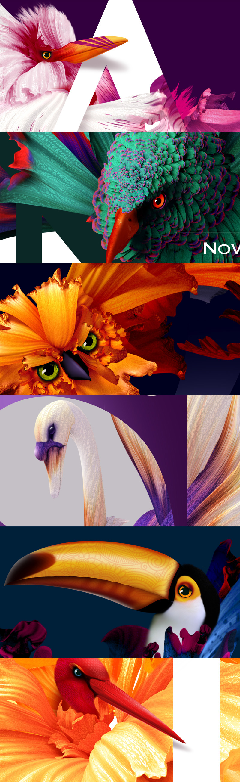
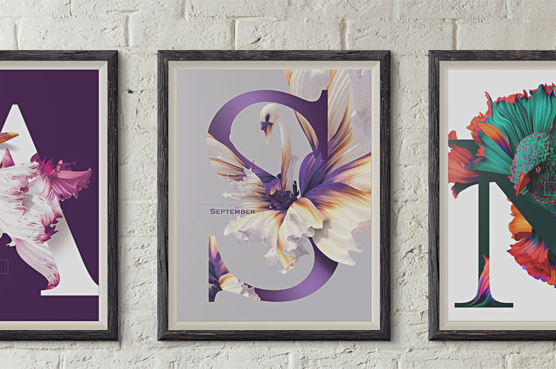
The bird illustrations, a motif for flying high and higher living, and the promise of an uplifting experience, feels well-suited to a convivial and accessible brand with craft and quality at its heart. This sense of conviviality and craft comes through in the posture and face of the birds, in the paper cut qualities of their rendering, the effect of bleeding ink, and flecks that give the impression of a mixed-fiber board. The ingredients are worked in well, doubling as wings. B&B Studio have done a good job to make these work for a large part of the range.

Branding and packaging for organic tea company Higher Living by B&B Studio, United Kingdom

A more robust logotype set over a curved baseline, and a logo mark that compounds a teapot and crown, functions and looks far better, both on pack and online. Placed within the top third, its positioning and proportion favors convention, but is practical, freeing the lower two thirds for image and type.
The logo lock-up effectively balances an element of quality and play in the mark, a sense of craft and heritage in the looser rendering of letter forms and overall typesetting, while organic is given increased prominence and tied directly to brand through positioning and proportion where before it appeared as a footnote.
Branding and packaging for organic tea company Higher Living by B&B Studio, United Kingdom
Although there is a variety, the profile of the bird provides a very strong sense of continuity, particularly when moved to different contexts, and servers as a good holding shape for color which is bright but natural, and emphasized by light backgrounds.
Where illustration and logotype is irregular, condensed type, in contrast, is precise, helping to define its position within hierarchy, clearly defining, alongside the color, posture, detail and environment of each bird, to define variety consistently.
"Higher Living · B&B Studio · Creative And Effective Design". Bandb-studio.co.uk. N.p., 2016. Web. 22 July 2016.
"Higher Living Organic Official Online Tea Shop". Higher Living Herbs. N.p., 2016. Web. 22 July 2016.

0 comments:

Flying Flowers 2016 by Artur Szygulski

11:29 PM Latice Design 0 Comments


0 comments: