

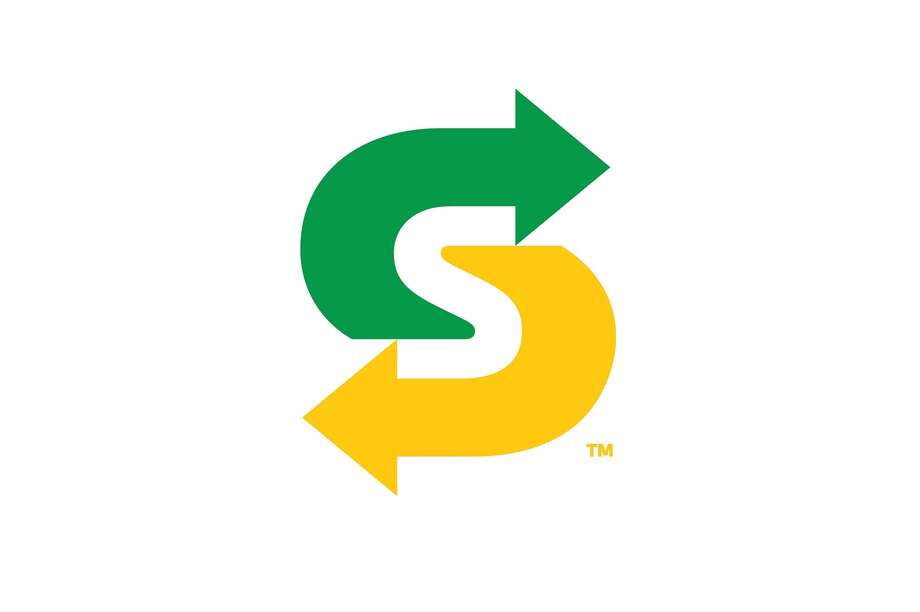
Subway introduced a new logo inspired by the 1968 design.
Subway is a very popular American restaurant franchise owned by Doctor’s Associates, Inc. Being the largest food chain in the world, it primarily sells submarine sandwiches and salads, operating in more than 36,804 restaurants in 100 countries around the world.
Subway is looking backwards -- all the way to the sandwich chain's founding in 1965.
"Fresh as a subject has really changed from when we introduced it 15 years ago when it was about making the sandwiches fresh and having fresh produce," said Chief Advertising Officer Chris Carroll. Now, he said, fresh is more about what goes into the ingredients, including concerns about antibiotic use.
Subway's new symbol
"It's not just an advertising change to the brand. This is an entire company effort, from products to the way we operate the restaurants."
1965–1968
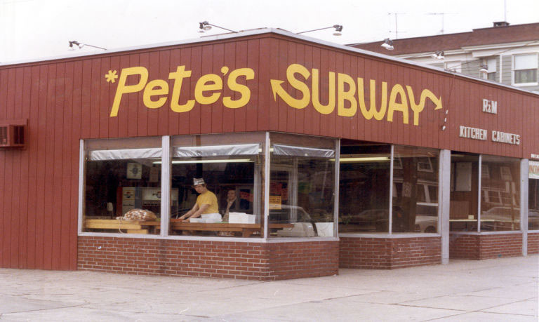
The below logo was used on the first "Subway" location created. It was owned by the chain's founder Peter Buck and thus he called the restaurant "*Pete's Subway" (with the asterisk included). One of the founders was Fred Deluca.

1968–2002
A oval variation of the logo.
Logo used in print advertising from 1996 until 2001.
2002–2015
Starting in January 2002, Subway started using a modified version of the logo. By early 2003, all branches had the new look. In this logo, the oval behind the wordmark was removed. The slogan used with this logo was "Eat Fresh.". As of 2016, this logo is still used as a secondary logo.

The slogan "Eat Fresh" under the logo.
2015–2016
On December 28, 2015, Subway introduced a new green-colored version of its current logo and a new slogan "Founded on Fresh," which was later changed to "Fresh is what we do." This logo is still used in all colors.
2016–present
On August 5, 2016 Subway introduced a new logo inspired by the 1968 design.
The Subway logo is one of the most popular and memorable food logos, with a very attractive, eye-catching and fresh look.
The first letter “S” and the last letter “Y” feature arrows which depict the entrance and exit of a subway. The green color used in Subway logo produces a great effect
and plays a great role in convincing consumers that the company is a healthy fast-food option as compared to others.The new lettering retains elements of the previous
design such as the iconic arrows, which the company says symbolize the choices
Subway provides its guests. This is the sixth time in the company's
50-year history that the sandwich chain has altered its logo.


0 comments: