Product Packaging Hair Care : Überliss

Hot patterns alert! Packaging of professional hair care products are usually quite plain, leveraging cues of science and technical when it comes to colours, finishes, and materials.


Design firm FormNation changed the status quo with the rebrand of hair care brand Uberliss. Talking of the design, the team says: “Uberliss requested a rebrand to feature a new look that is both sophisticated and upscale, suited for the most prestigious salons.”

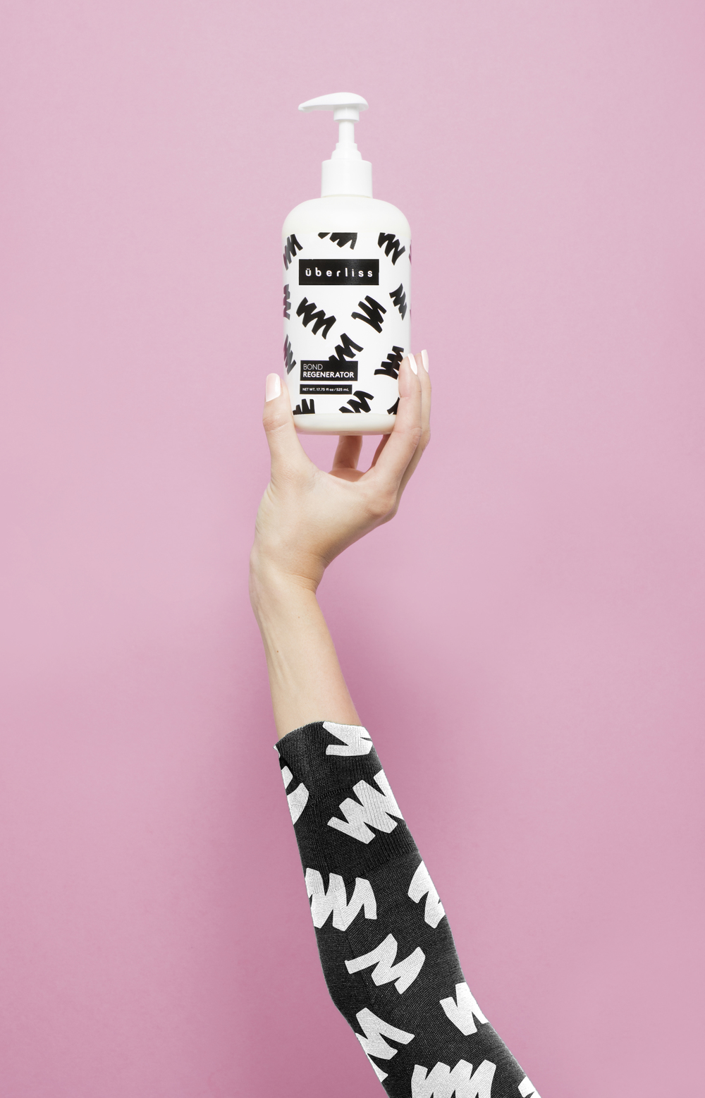
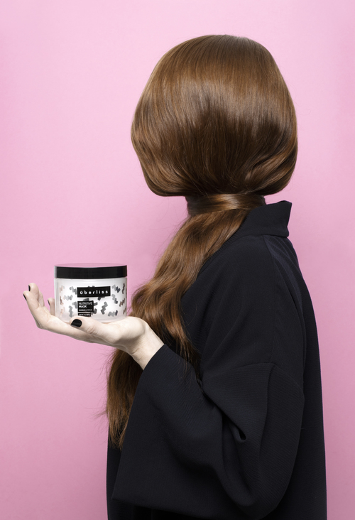
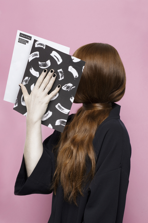
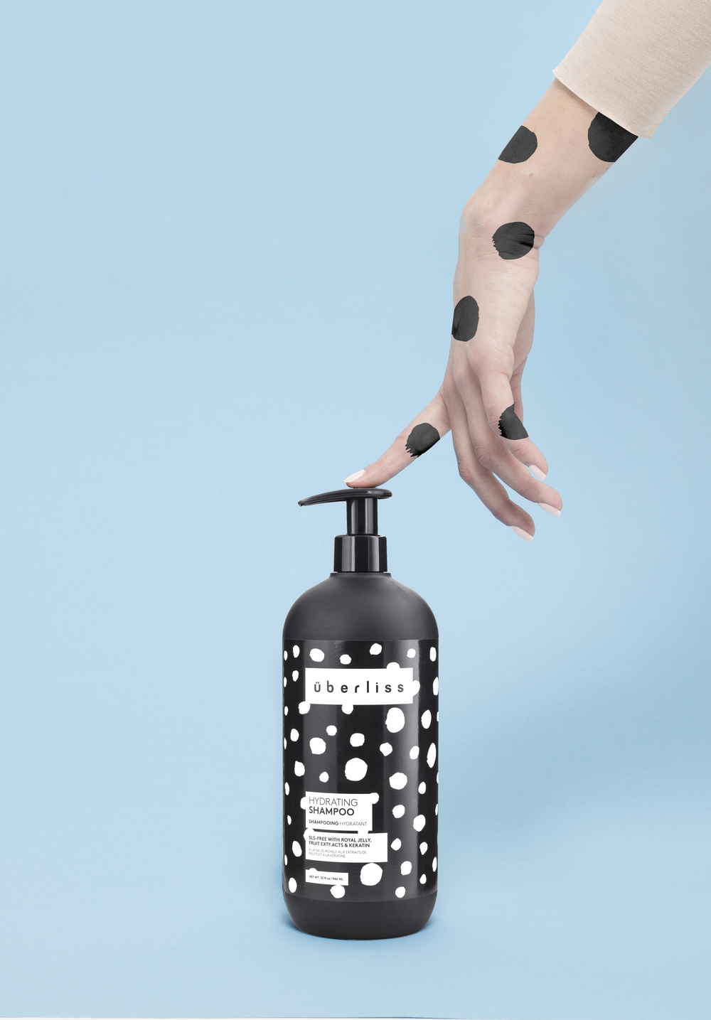
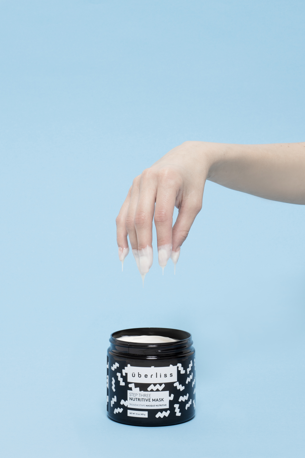
The product market is saturated and brands need to differentiate themselves in more creative ways. The packaging of Uberliss incorporates hand-drawn artworks and fashion-forward design to create something non-traditional and avant-garde. The design included hand-drawn patterns for each ingredient based on what each product does with our hair – straightens, curls, dyes, washes, conditions.
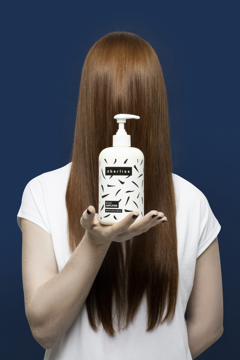
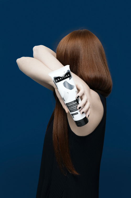
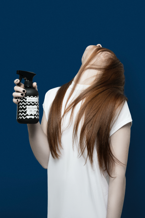
FormNation divided the design into two lines: black bottles for the salons (UV proof) and white bottles for the consumer. The top layer features information blocks and the layer underneath is dedicated to graphics that can change with the trends based upon the playfulness of the brand.
A beautiful work of art.
"Überliss ‹ Formnation". Formnation.com. N.p., 2016. Web. 27 July 2016.


0 comments: