

Pantone Color 2016 - Serenity & Rose Quarts disciplines globally.


Rose Quartz and Serenity demonstrate an inherent balance between a warmer embracing rose tone and the cooler tranquil blue, reflecting connection and wellness as well as a soothing sense of order and peace.
 Empty ice-cream cone against a pink and blue background by lumina images
 facade of the house with fire safety stairs by aragami12345s
 Blue Hydrangea and purple rose by leungchopan
playful pastels and fun patterns by Milk Design Souffle Sweets on the plate. Minimal Vanilla style by Evgeniya Porechenskaya
 Deer in the snow by Alin Brotea
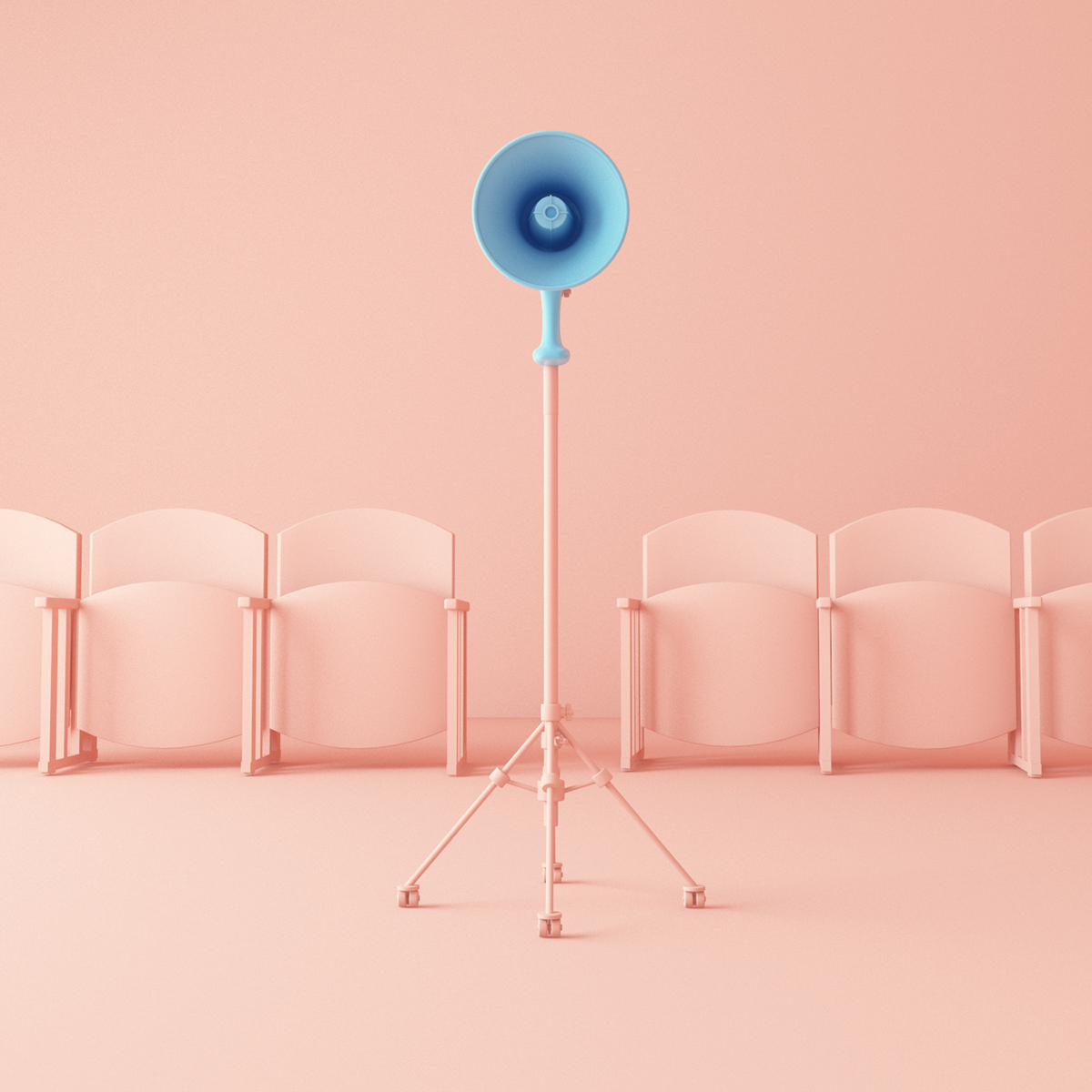
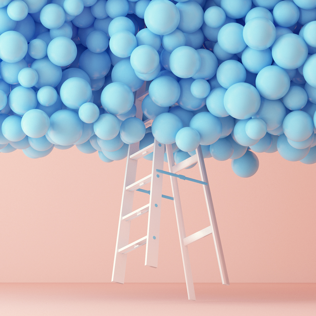
Souffle Sweets on the plate. Minimal Vanilla style by Evgeniya PorechenskayaDeer in the snow by Alin Brotea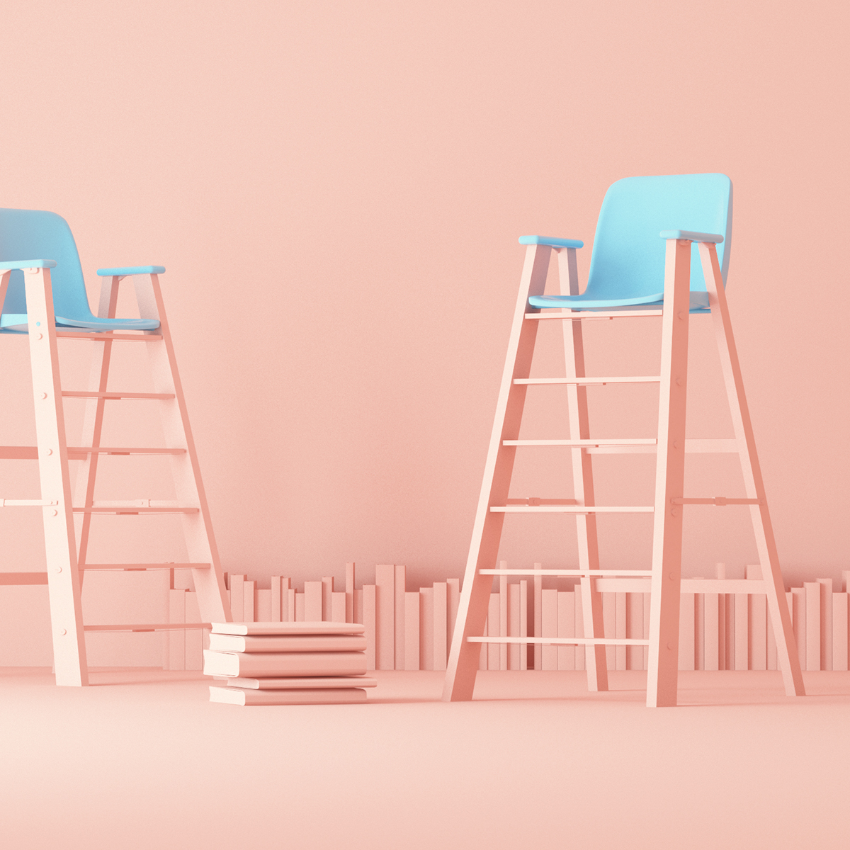 art direction | ladder + balloons | Be SpectACTive! Festival - ID on @Behance
Traditional Crystal Chandelier from fashion-isha.com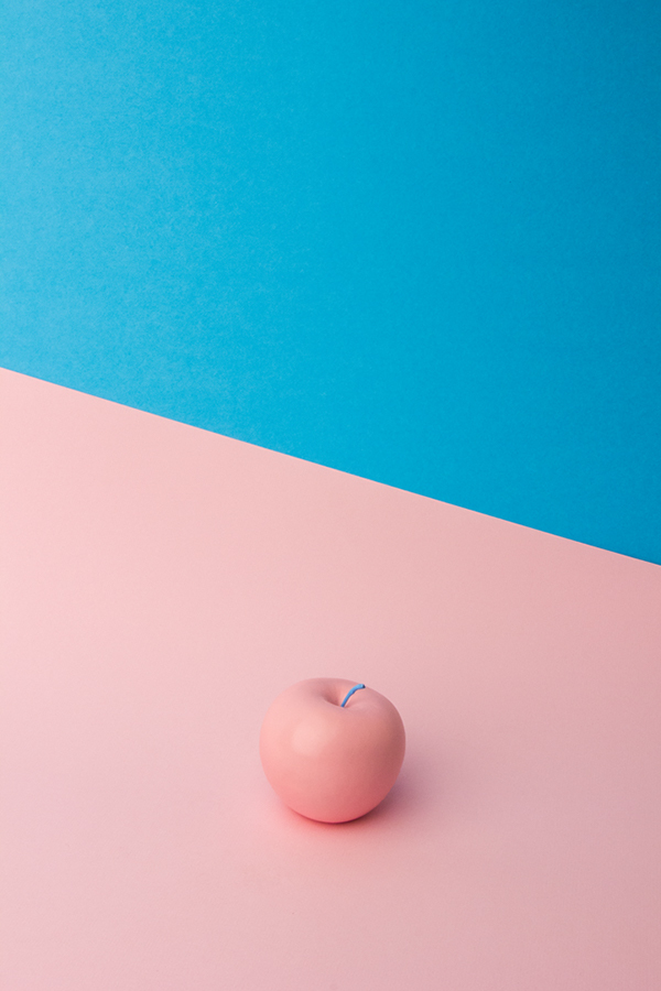
Color Morphology by André Britz on Behance
Pastel colored Ombre nail art.

Set Design

Tessellated Flooring with pantone 2016
KitchenAid’s iconic Stand Mixer in Guava Glaze
Pantone UNIVERSE mugs in the 2016 colors of the year
We found various photographs on pinterest inspiring the panton pallet 2016.
The prevalent combination of Rose Quartz and Serenity also challenges traditional perceptions of color association
.“We look at the history of where we’ve been with color and ask ourselves, is this a time for change? Our feeling was: yes.”
What’s come through loud and clear is that Pantone’s Color of the Year is arguably most interesting as a conversation-starter, never as a dictum to be blindly obeyed. Their selection process pinpoints colors that seem ascendant across design disciplines globally — fashion, interiors, housewares, packaging and product, graphic design and more — but not yet completely dominant. They choose a color reaching a tipping point and give it a public nudge, so we all finally notice it and talk it over.


0 comments: