

UEFA European Championship branding 1968 - 2016 .
Soccer fans are getting excited as the UEFA European Championship kicks off in France this week (and on television screens around the world). This is the 15th time that European soccer elite will meet to battle it out for the European crown. And, like with all major sporting events these days, the tournament will be abuzz with an array of advertising, branding and events. Marketing activities grow larger and larger every year, as brands latch onto the event as a way to market their products.
But what about the UEFA European Championship brand itself? Every four years the Euros logo also gets made over for the tournament, often times taking on symbolic elements of the host country. Throughout the years, the logo designs have gotten more and more sophisticated. Yes, even in soccer design and aesthetics are important!
Here’s a look at the evolution of the UEFA Euro Cup logos over the years:
1968 – 1992
—
The first seven times the European Championships were held—between 1968 to 1992—the logos were very similar and form a cohesive group.

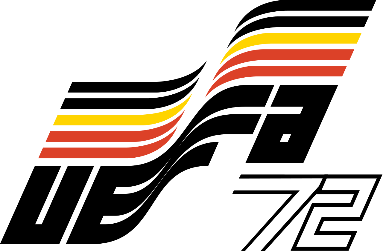


Each of these logos is comprised of the flag of the respective venue and the year of play. The organizing committee—the Union of European Football Associations (UEFA)—acronym is printed in a bold, geometric font and attached to two copies for the host country’s flag to create one dynampic, flapping flag. The year is outlined, giving these Euro Cup logos a real old-school, retro feel. These designs may not win a design award, but they’re an authentic representation of the emblematic sports design style from the 70s to the early 90s (and which has made a recent resurgence in popular “vintage” clothing styles). This set of logos play our our emotions, create a sense of nostalgia and fondness for the event.
1996 in England
—
In 1996, the Euros returned to the motherland: England. This happy, color logo is markedly different from it’s predecessors (and was perhaps inspired by the Queen’s favorite colors?) The design is playful, almost childish. The soccer ball is subdivided in such a way as to represent a player kicking a ball. The line of the player moves from lower left to upper right, symbolizing the dynamic, athletic movement of the sport, and indicating an upward climb (like a tournament is a climb to victory). Below the icon the wordmark is comprised of three different typefaces, perhaps symbolizing a coming-together of multiple countries and cultures. The brush-like underscore again generates movement. As it was individually adapted to the event, this logo feels fresh and unique in comparison to the ones from previous years.

So who felt that upward swing of movement in 96? Germany did, taking home the cup.
2000 in Belgium and the Netherlands
—
Again, the national colors of the host countries are used to create the color scheme. The typography, however, is much more delicate and less playful. It’s also been reduced to only two fonts, creating a much cleaner look. A generic human-like shape is made up of the combined flag stripes of Belgium and the Netherlands. He has a floaty, kite-like appearance, making him look like a medium gust of wind could pick him up and fling him across the field. Again, the design moves from left to right, down to up, showing movement, but because it’s so top-heavy it makes it look like the player is unbalanced and about to fall over. A small football sits in the center to balance the design and a bluish gray circle ties all of the elements together. This is probably the worst UEFA Euro Cup logo to ever play the game.

Which team was able to remain balanced in 2000? France took home the cup that year.
2004 in Portugal
—
It’s going to be sunny! 2004 takes us to beautiful Portugal, which is known for sun, sea and a great passion for football, all of which translates clearly to the logo! While blue dominated the previous years’ logo, it is missing completely in 2004. Instead, the logo is comprised of a bright orange, yellow and green giving the logo a touch of warmth and hospitality. Similarly, there’s nothing resembling a player anywhere in this logo. While this version of the logo is a nice change of pace, the soccer ball emblazoned in the center of a cliché, curved heart is not very subtle in its symbolism. The significance of the seven green dots along the right side is less clear. A relationship with nature? Soccer? The designer just liked polka dots?

Greece found a place in the hearts of spectators this year as the surprise winner.
2008 in Austria and Switzerland
—
Austria and Switzerland are known for their mountains—and these high peaks are the prominent feature in the 2008 Euro Cup logo! Both countries’ flags are also comprised of red and white, making them the natural colors to select. The shape of the peaks and the red color could also have another meaning: the game is on fire! Nestled inside the red swoop, a green ball—its colors reminiscent of the unspoiled nature we associate with alpine countries—offers contrast to the red. For the first time, the sport is associating itself with nature. The font this year is a simple sans-serif in several weights, perhaps a nod to Swiss minimalism?

Apparently the Swiss and Austrians aren’t the only ones good at climbing mountains: Spain took home the championship in 2008.
2012 in Poland and Ukraine
—
Four years later, the 2012 UEFA Euro logo was significantly more feminine than ever before, and even more tied to nature. It’s comprised of a stylized flower with abstract football as its main blossom and the national colors of Poland and Ukraine as accents. Inside the flowers and the ball, a human-like figure appears to throw his hands up in victory. This logo brings sport and nature together. Not only is it a literal flower, but the shapes are more rounded and organic than its predecessors’. But does this association between hard-hitting professional sports and the beauty of nature really work? Not really. This logo is more reminiscent of Eastern European folklore than it is of athletic prowess.

Spain (once again) plucked the flower and went home with the win.
2016 in France
—
Soccer meets art! For the first time in history, the trophy is part of the Euros’ logo. Previously, this was a differentiator between the look of the Euro Cup logos and the World Cup logos. No surprise, the color combination of blue, red and white represents France, the host country. This new logo is much more modern and subtle than its predecessors. There is no ball, no player, no obvious or traditional country symbols. Rather, meaning is created through form and abstraction. Circles, stars and arches are reminiscent of a smiling face. But even after prolonged viewing is not clear how the individual picture elements are thematically related to each other. The logo opens a wide scope for interpretation.

Who do you think will win the UEFA Euro 2016? Let us know in the comments!


0 comments: